Website Storytelling
Translating a narrative to a webpage.

Category
UI/UX, Motion
Tools
Adobe Illustrator, Figma, FigJam
Location
Cary,
North Carolina
Role
Designer and
Prototype Developer
Why two projects?
The designs featured on this page are crafted to tell stories through immersive web experiences, drawing inspiration from scrollytelling. By emphasizing user interaction, each design invites visitors to engage with elements throughout the page, creating a dynamic and captivating narrative.

Utilizing Spotify Data
Over the span of a week, I delved into Spotify's top songs playlists from various years, aiming to uncover correlations within the data.
My objective was to transform this data into a compelling narrative through creative visualization. By carefully selecting and arranging the data, I crafted a story that reveals intriguing connections and trends over time. I aimed to offer unique insights into the evolution of music preferences.


Finding a Correlation
Looking through various categories of data within the set, there were a few connections I found, but some were not strong enough to generate a narrative.
Pacing and Popularity
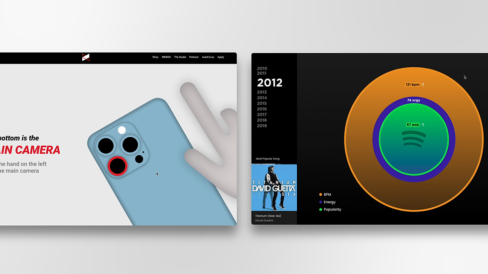
Over a decade-long span, a fascinating trend emerges from the analysis of Spotify's top songs playlists: a gradual decrease in both BPM (beats per minute) and energy levels of songs, juxtaposed with a simultaneous increase in their popularity. This intriguing correlation suggests a shift in musical tastes and preferences over time.


Introduction
The website's opening pages introduce the narrative and provide a legend for the project's color scheme. This sets the stage for viewers to engage with and understand the symbolism behind the colors used throughout the project.

Changes Each Year
As the user scrolls, they'll notice the circles representing BPM, NRGY, and POP units dynamically changing in size, reflecting fluctuations in these metrics. Additionally, the gradient direction of the circles shifts, indicating the directional movement of these values. At the bottom left, akin to a Spotify player, the most popular song for that year scrolls through, providing a dynamic and engaging browsing experience.

Final Comparison
Upon reaching the end of the page, the final year's circles split in half and are juxtaposed with the circles representing the metrics from the first year of the dataset. This layout enables a direct comparison, visually showcasing the changes that have occurred over time.
Translating an MKBHD Video
The inspiration for this project stemmed from questions about the boundary between content and form. When translating a YouTube video into a website, I wondered whether the form is an inherent part of the content and where the line between them lies.


Keeping to the Script
Preserving the script was crucial in creating this site to grasp how the form's transformation influences its impact.
How does form affect content?
When it comes to converting a video in a text-based format certain things are lost. The environment, people, things, and color to name a few. How can these aspects of the video be reintroduced and how can they leverage the benefits of the new form? Thinking about these questions helped lead me to focus on bringing in different aspects.

Personality
The website had to capture the same personality that Marques Brownlee embodies in his videos.
Imagery
This was difficult but vital to keep the translation cohesive. The imagery from the video was important to be translated into the web content
Brand
Given Marques Brownlee's existing website and brand, it was essential to ensure that the new site aligned seamlessly with his established examples.
Smartphone Cameras vs Reality
This video delves into the evolution of smartphones and their impact on photography, revealing how they increasingly alter the photos we capture, diverging from reality. Utilizing the script, I've crafted a scrolling narrative prototype, covering the video's content up to the 2:50 mark.

Landing Page
The landing page of the scrolling website adopts the branding and design elements reminiscent of MKBHD's current website, primarily utilized for commerce. This includes their navbar and dot matrix background.

Engagement
One of the primary advantages of web-based content is the ability for users to interact with it at their own pace. In line with MKBHD's personality and his focus on showcasing phones, the website enables users to directly visualize what is being described. Through dynamic visuals and interactive elements, users can immerse themselves in the content, allowing for a personalized and engaging experience that reflects MKBHD's style.

More than Just Phones
Beyond phone shots and interactive content, expressing emotion and creativity through dynamic graphics and illustrations enriches the website's storytelling experience, in line with MKBHD's distinctive style.
.png)
Looking Back...
Developing these designs provided an opportunity to explore integrating motion and interactions in sync with the natural downward flow of web pages. I enjoyed the challenge of envisioning the content visually to enhance its intuitiveness and narrative.